· 3 min read
How Soundcheck Tests Survive a Redesign
Soundcheck tests describe what a user is trying to do and what should be true afterwards, not which buttons to press, so a redesign doesn't break them. Only a change in behaviour does.
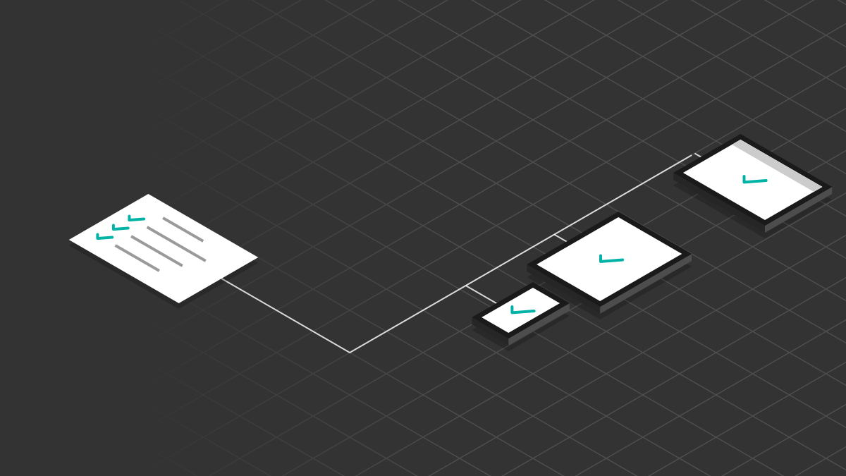
End-to-end tests for mobile apps are slow to write and quick to break. A typical one finds a button by an ID, taps it, waits for a view, then checks some text. Move the button into a menu and the test fails, even though the app works fine.
That test is pinned to how the app is built today, not to what it's for. My answer was to write tests about goals and observable outcomes, not steps, so a redesign stops breaking them.
Soundcheck, my open-source Claude Code plugin where AI agents are the testers, is built around that idea. Its first user is Solo Scores.
Describe the goal, not the route
A test should say what a user is trying to do and what they'd notice afterwards. It shouldn't say which buttons to press, in which order, or how to find them.
That's what a good manual test plan already does. "Rename a list and check the new name shows everywhere" is a test any QA engineer would understand, and it stays true whether the rename lives in a long-press menu, a swipe action or a settings screen. If the tester works out the route itself, a redesign doesn't break the test. Only a change in behaviour does, which is the thing you wanted to catch in the first place.
In Soundcheck the tester only sees the spec and the screen, never the source. It has to find its way the way a person would, so the spec has to be written for that reader.
What that looks like
Here's the shape of one, for a made-up shopping list app:
## Goal

Take the app offline, check off `Eggs` and `Oat milk`, then bring it back online.

## Outcomes

- Offline, the items check off as usual.
- Back online, they stay checked, and a second device sees them checked.
A sentence of goal and a short list of outcomes. Nothing in it mentions a button, a screen or a gesture, so nothing in it goes stale when those change.
Exact steps are allowed only where they guard a past bug. Everywhere else, the route is the tester's problem.
Make every outcome observable
Dropping the steps only works if the outcomes are sharp. Each one has to name something on screen that's either there or it isn't.
Compare "undo works properly" with "undo brings the erased part back". The first leaves the tester deciding what "properly" means, and two testers will decide differently. The second can only be judged one way.
A few rules keep outcomes honest:
- One thing per bullet.
- Concrete enough that two testers would agree.
- No layout details a design tweak would break, like header text or button order.
When an outcome comes back unclear, the fix is to name what's on screen when it holds, or split it in two. Never loosen it until it can't fail.
A side effect worth having
Because the testers find controls the way a screen reader does, by their labels, an unlabelled icon button isn't something to work around. It's a finding, and fixing it makes the app better for screen reader users too.
Takeaways
- Test what the user is trying to achieve, not the route they take. Routes change; goals mostly don't.
- Write every outcome as something on screen that two people would judge the same way.